Skip navigation

Branch case study

Rocky Mountain Credit Union

New Construction Flagship Branch | Design Build

the goals

Help a credit union transform its branch network to better support a booming Montana community. 


Project Background

Rocky Mountain Credit Union (RMCU) has been serving Montana communities since the 1940s, and in that time they’ve experienced a lot of change. Just in the past decade, the credit union has doubled in assets. Now technology is revolutionizing the way people interact with their financial institutions and the population of the Gallatin Valley in Montana is booming, so a few years ago the credit union set out to transform their branch network into one that best serves their membership today and in the future. Rocky Mountain Credit Union chose Momentum for the branch design build project, building on the two organizations’ long-standing relationship.

A Montana Icon Updated for the Digital Age

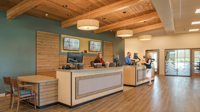
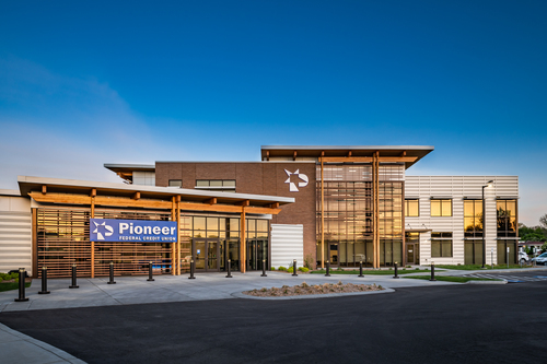
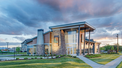
On the northern edge of town, with a backdrop of Montana’s iconic mountainous terrain, stands Rocky Mountain Credit Union’s 5,000 square foot flagship Baxter branch. The Momentum team designed this branch as a celebration of this classic scenery with steel beams, wood panels, natural rock, weathered metal signage, and a glass façade that reflects a panorama of blue sky and mountains.

"When you walk into this branch, you know you’re in Rocky Mountain Credit Union.” - Ed Stofko, President & CEO / Rocky Mountain Credit Union

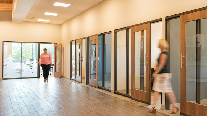
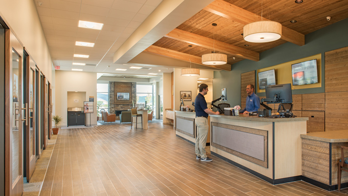
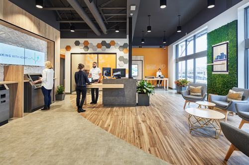
The inside of the Baxter Lane branch is bright and open, featuring tall ceilings with exposed wood beams, and glass walls in the private conversation rooms fill the branch lobby with natural light. Large hidden drawers in the wall hide away printers, equipment, personal items, and other clutter. But most of all, the branch feels BIG, leading members and staff to question whether the branch may actually be bigger on the inside than the outside.

 

Rocky Mountain Credit Union’s new branch design and branching strategy focuses of conversation and personal interactions. When members walk into the Baxter branch they are greeted by mobile staff members supported by two teller pods and various casual and private settings. This makes it easier for staff members to engage with members in the most natural and supportive setting.

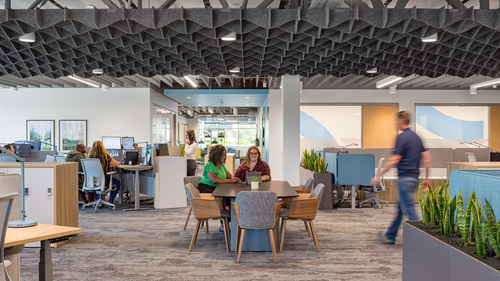
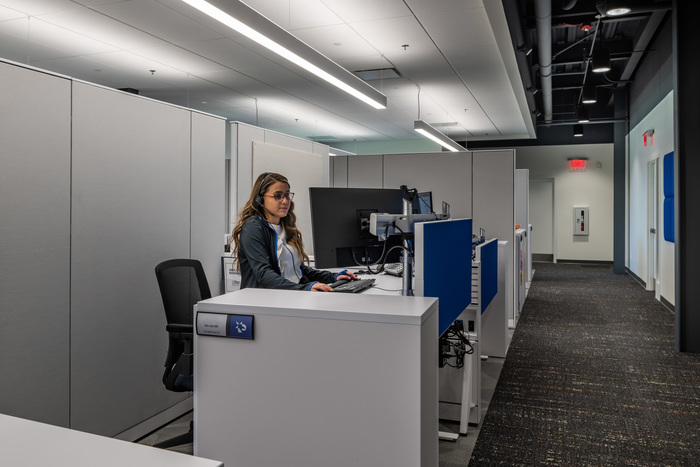
The Huffine branch, RMCU’s regional hub, was beginning to feel cramped in both the branch and operation spaces after a decade of rapid growth. Momentum’s design team did away with the traditional teller line in favor of a teller concierge area. This freed up branch staff to move around and engage with members more easily. The operations space received a similar treatment, with modern workspaces that give the office staff room to move and collaborate.


Despite a significant increase in traffic, members find the new branches less crowded and more welcoming and the staff have an easier time connecting with them to serve their more complex banking needs.

"Momentum understands our organization’s goals and structure, and the purpose of how we serve our members. They translated this understanding into a branch design that aligns with our culture and brand." - Ed Stofko, President & CEO / Rocky Mountain Credit Union

Momentum Moment

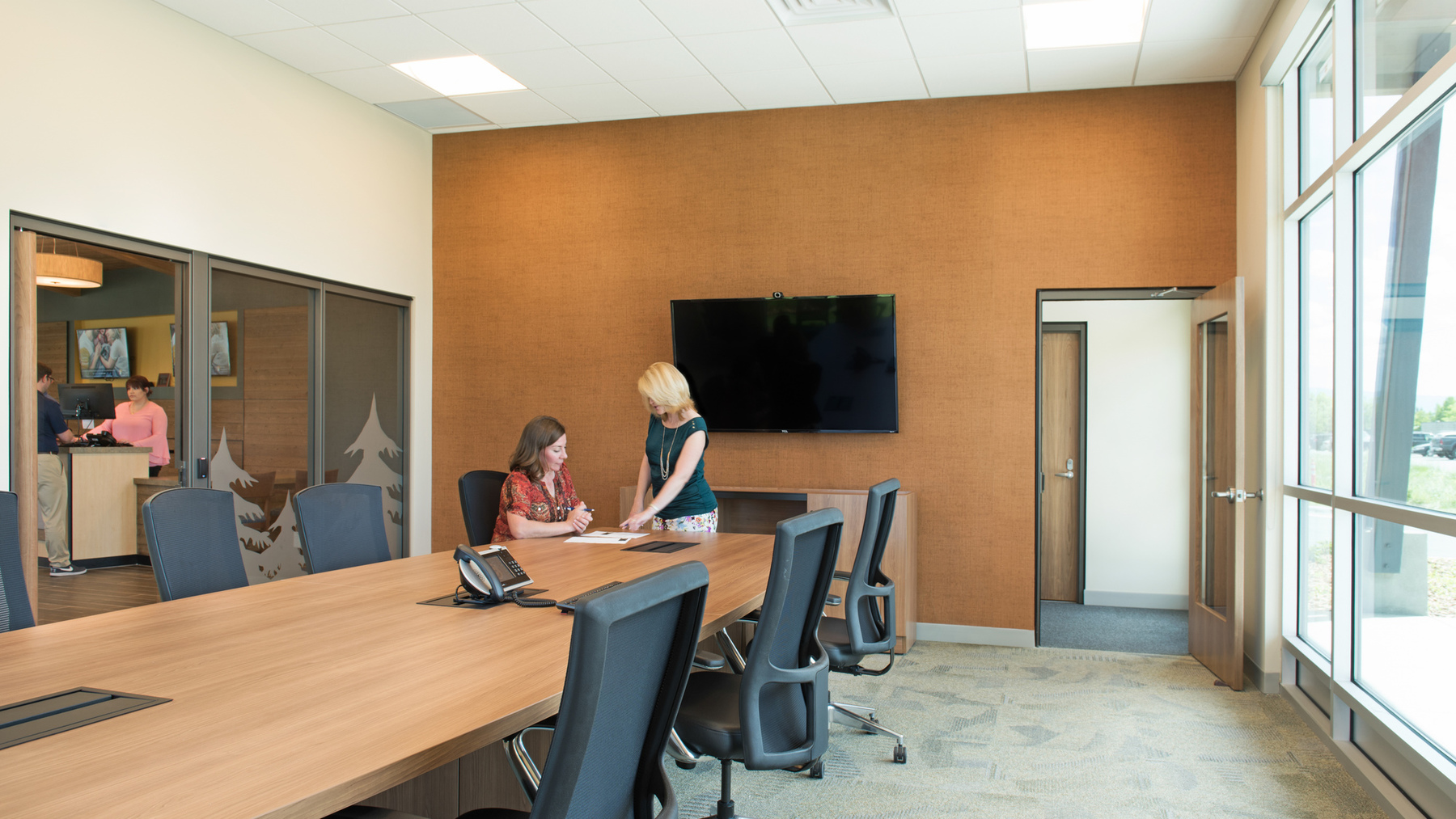
One thing that’s hard to come by in this town booming with college students and technology entrepreneurs is meeting space.

The team conceived a community hub, located within the branch, that could both support RMCU’s daily operations and help it connect with the surrounding community. The hub is now a valued community asset, providing professional, after-hours meeting space.


CTA
Branch, Resources, Workplace
Guide: How to Write a Credit Union Facilities RFP