Skip navigation

Branch case study

Red Canoe Credit Union

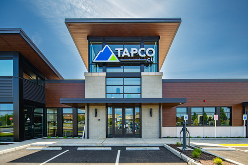
Lake Tapps Brand Refresh Branch | Design Build

the goals

Define the future of branching for Red Canoe Credit Union. 


Project Background

Red Canoe Credit Union updated their branching strategy to enter new urban markets while exploring the future of financial retail and experimenting with new technology. While pursuing these goals, the credit union also wanted to ensure their image still reflected a relaxed pacific northwest atmosphere.

But above all, the goal was to provide better member services and focus on cultivating deeper relationships. And it’s through this member-focused lens that the new branch was designed.

Developing Stronger Relationships

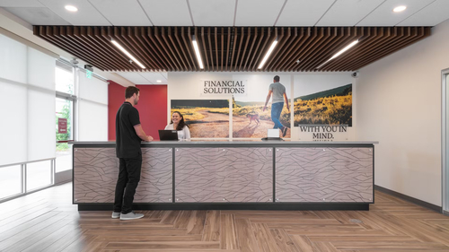
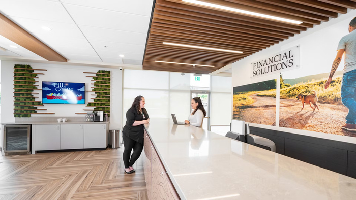
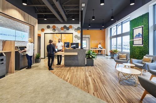
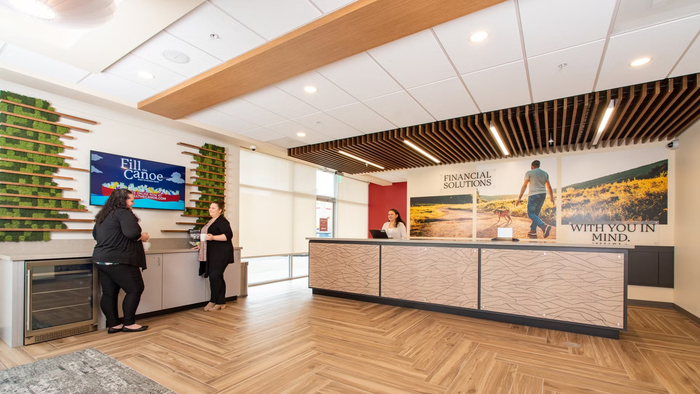
The first thing that a member notices when walking into the new branch is the relaxed pacific northwest vibe. The space is wide open and bright, building on the traditional Red Canoe brand colors with greens, blues, and natural material tones throughout. Real wood and a unique moss wall bring the atmosphere of the branch to life.

Once in the branch, members are greeted by Red Canoe’s universal associates who are ready to help with any issue. The lobby features a clean teller bar that creates a casual and personal setting for members and staff to interact, while untethered and unobtrusive devices provide seamless technology support. The result is a full-service branch where a visit feels more like meeting a friend for coffee, and it is through these natural human connections that staff are able to build more authentic and meaningful relationships with members.

The open layout also allows for natural social distancing and comfortable interactions during the pandemic, and a 24/7 ITM lobby gives members access to a live person and full range of banking services without any in-person interactions.
Momentum Moment

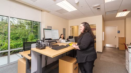
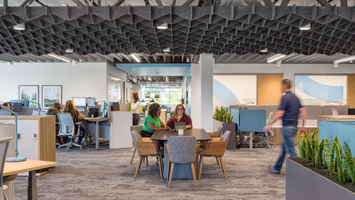
To support the clean and open retail space, Momentum’s design team developed a bullpen that naturally supports back-of-house activities and provides spaces that the employees can personalize.

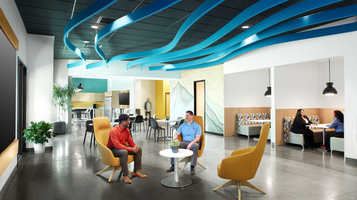
The central feature is a four-desk workstation featuring ergonomic sit-to-stand desks. There is abundant natural light with a bright and energetic atmosphere, creating a space where employees can feel comfortable as they do paperwork, participate in training, or enjoy their downtime.


CTA
Branch, Resources, Workplace
Guide: How to Write a Credit Union Facilities RFP