Skip navigation

Branch case study

Frontwave Credit Union

Rebranded Branches | Design Build

the goals

Activate Frontwave Credit Union’s new brand in a branch environment designed to resonate with both prospective and current members in the community.


Project Background

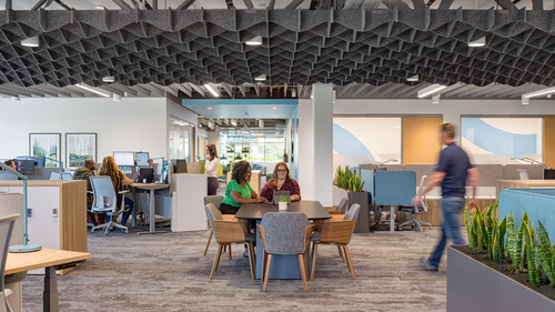
Frontwave Credit Union, previously Pacific Marine Credit Union, embarked on a mission to transform both their brand and their branches to appeal to a wider member base. They needed their bold new branches to stand out in the community and to make their new brand known to US Marines, the credit union’s traditional SEG group, and the general public. Frontwave also wanted to create a branch that lies at the intersection between traditional and modern design, with a layout that encourages unrestricted personal interactions and features that make older members feel comfortable and welcome.

Serving the Larger Community

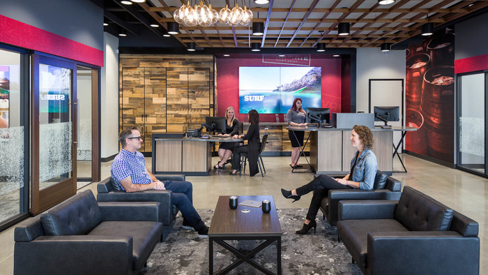
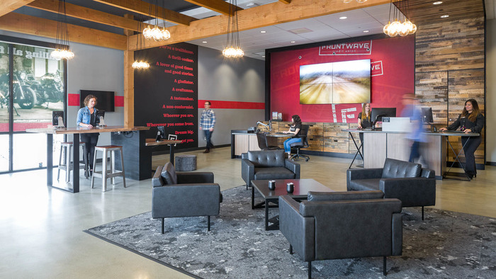
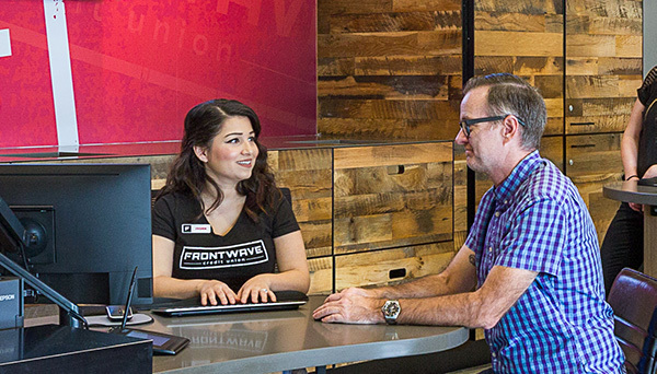
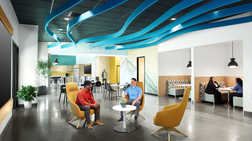
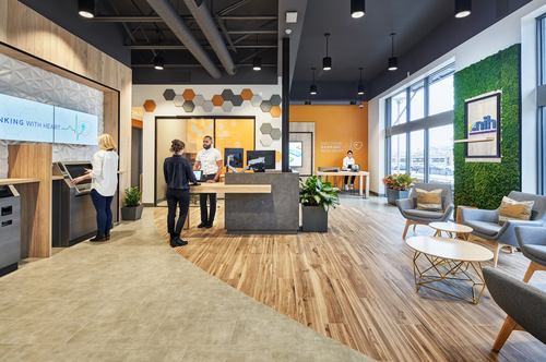
Frontwave Credit Union’s new brand provides a fun and interesting platform for Momentum’s designers to work with. The materials are rugged and natural: polished concrete floors, weathered wood accents, and stone textured carpets, and the wall graphics feature images of popular activities in the community such as dirt biking. This creates a comfortable yet engaging atmosphere where members both young and old are inspired to think about their financial goals in terms of their passions.

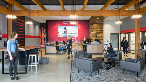
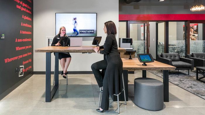
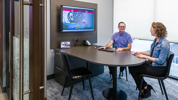
The new design also offer members a variety of interaction spaces that empower them to bank on their own terms. They are greeted by staff members who can move the conversation to teller pods or more personal spaces, a tech bar and hotel offices, where the transaction are supported by laptops and mobile technology. These choices help members feel at ease in the branch and cultivates better relationships with their credit union.

Momentum Moment

In an average bank branch keeping clutter under control can be a challenge. How could Frontwave Credit Union reconcile clean, open spaces with a need to store an array of gadgets and devices from card issue machines to printers?

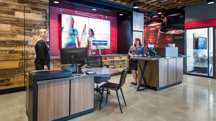
Momentum’s team came up with a branch design solution for the credit union that would make Marie Kondo proud: the brand wall behind the teller pods features custom hideaway casements, each purposefully designed to discreetly yet conveniently provide access to these devices without becoming clutter magnets. The branches were designed with storage in mind, and the result is a clean space that actively resists clutter and makes life easier for Frontwave’s staff.


CTA
Branch, Resources, Workplace
Guide: How to Write a Credit Union Facilities RFP