Skip navigation

Branch case study

Central Willamette Credit Union

Salem Branch | Design Build

the goals

Grow the Salem market with a with a modern branch that has a billboard presence and welcomes new members while maintaining brand consistency for the existing membership base.

Project Background

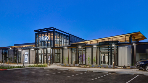
Salem is a priority market for Central Willamette Credit Union, and this location checked all the boxes for growing the credit union’s presence. It’s on a main road with excellent visibility and represents a perfect opportunity to be a billboard for the branch.

The staffing model for this branch needed to maximize efficiency with high traffic volumes predicted, but also provide staff with the freedom to meet and assist members where they were most comfortable. There was also an additional challenge presented in the shape of the space, which is narrow and deep. The Momentum design team set out with a goal of making this a strength rather than a weakness.

A Welcoming and Efficient Member Experience

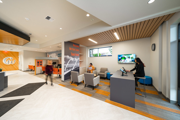
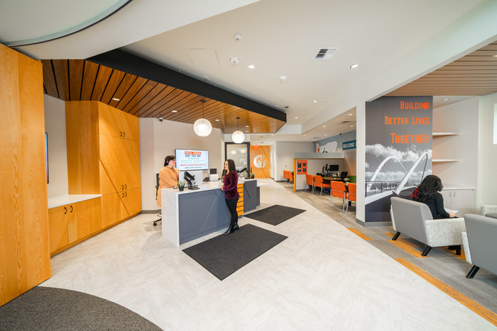
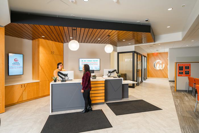
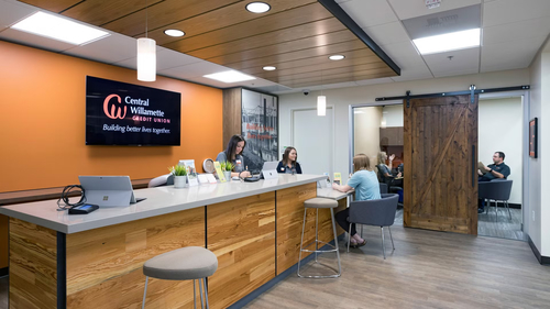
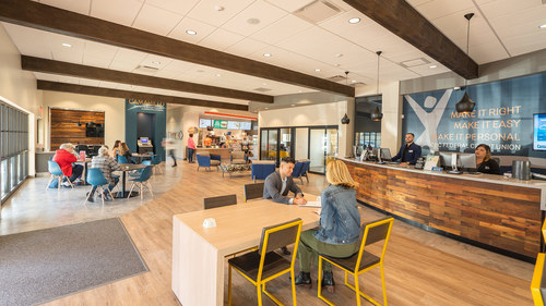
The focal point of the branch is an open FSR (financial services representative) station, set at an angle that makes the space feel bigger and more open and removes the appearance of a barrier between members and staff.

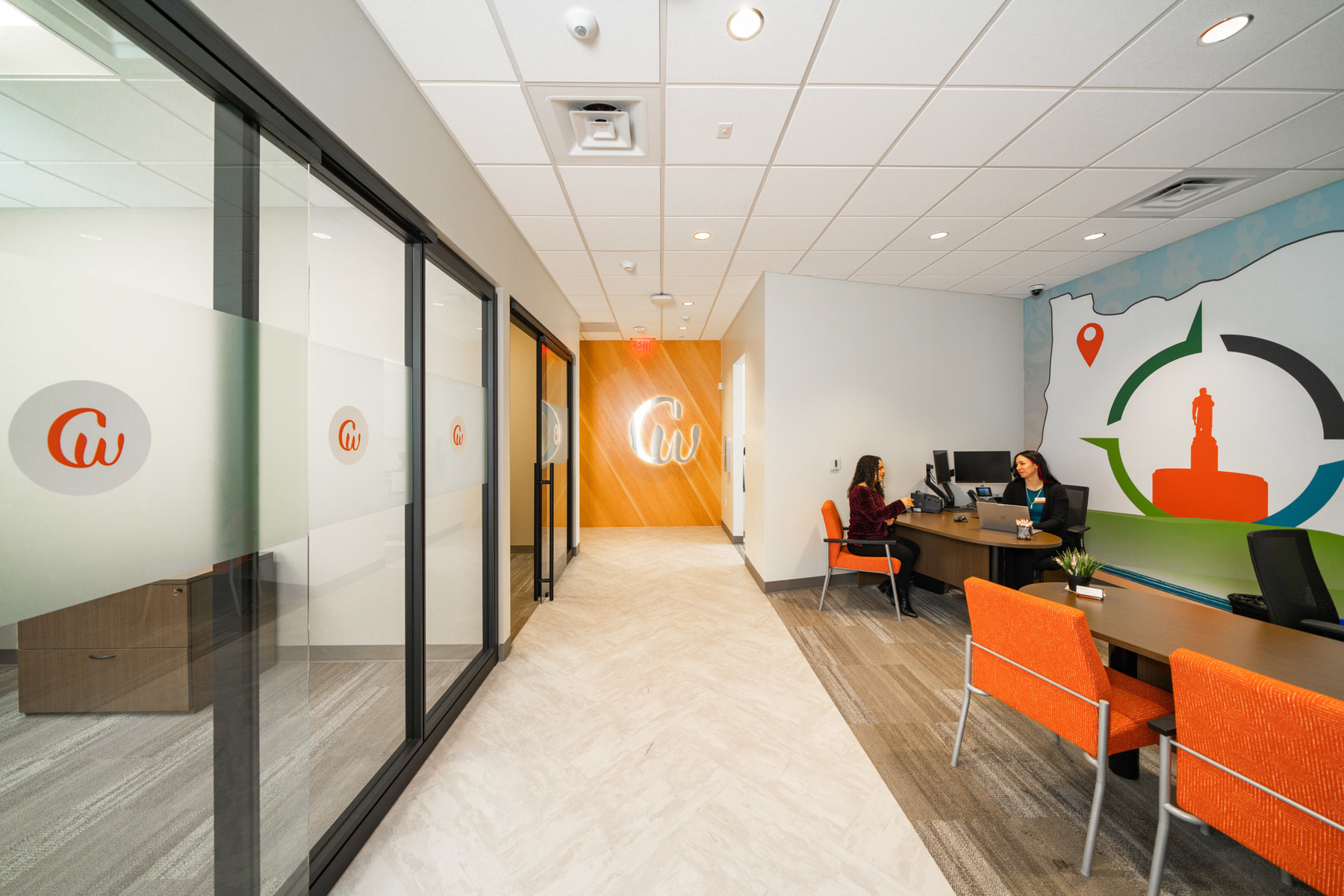
When members come into the branch, they are greeted by an FSR who can facilitate their transactions either at this station or one of the semi-private hotel desks along the right side of the branch.

The combination of these two attributes creates an open and welcoming atmosphere that makes the space feel bigger than it actually is. The main Central Willamette signage is at the very back of the branch, and it stands out as a focal point. Where a more traditional layout might create a narrow corridor, the layout creates more of a big open space that allows the branded elements to pop.

Throughout the branch are acoustic dampening materials that counter noise distractions that might otherwise exist in an open space like this. This includes the “clouds,” the drop wood ceiling feature that dissipates rather than reflecting sounds. Our design team takes careful consideration to minimize this type of distraction with acoustic design and material selection.

Momentum Moment

Central Willamette had recently refreshed their brand and were looking for a new modern branch design that bridges the gap between the new and familiar brand identities. This presented a unique challenge that our clients face frequently with branch projects around a branding initiative.

Our design team picked out finishes and colors that referenced the look and feel of existing branches, building on them with contrast and color to create a fresh and new feeling for the space yet keeping the Central Willamette brand consistent with other locations.

The result is a stunning modern branch that is still unmistakably Central Willamette Credit Union.


CTA
Branch, Resources, Workplace
Guide: How to Write a Credit Union Facilities RFP