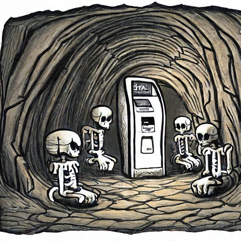
Navigating a dark and scary dungeon is worth it for treasure, but would you do it to talk to a branch associate? A TikTok video shows a horror story in the making at one unstaffed branch.
We often speak about what it means to effectively activate your brand in a branch environment, and how to create a welcoming environment. Verity Credit Union exhibiting local artwork. NIH Federal Credit Union creating a fresh and healthy environment with plants and natural materials. First Fed embracing Pacific Northwest vibes with their moss walls and topographic maps.
But sometimes it’s easier to fully understand a concept like this by looking at a negative example.
A national bank recently had one of their unstaffed branches go viral on TikTok. This is a particularly interesting case study, and we think it’s worth analyzing the branch and the customer’s reaction.
Before we dive in, watch @mel__in__sd’s video below:
@mel__in__sd This gave me the creeps #DoritosTriangleTryout #dystopianfuture #newbanking #atm #wlw #queertiktok ♬ Bitch Betta Have My Money - Tyga
(Click here if the video fails to load to watch it on TikTok.)
The issue here isn’t necessarily the unstaffed branch, but rather the gap between the intended purpose of this branch and the design.
As you can see in the video, this is a fairly large footprint branch that consists mostly of a cavernous lobby. There are ATMs way at the back of this room, and for more comprehensive services there are private offices with video terminals to speak with banking experts at an HQ or hub brand. In the middle of the lobby is a table.
The purpose of a lobby like this is to create a space where mobile staff can greet customers at the door, have conversations to understand their needs, and to start building a deeper relationships. At the table in the middle, supported by a laptop or tablet that the associate can carry with them, they might have an in-depth conversation about topics ranging from opening a new account to taking out a mortgage.
But without the human interaction?
The space becomes a large, empty void. The customer has to walk quite a distance to reach the ATMs at the back of the branch, and at this point they may have a feeling of isolation from people walking on the street.
And if they do need human assistance, they must enter one of the offices. These rooms are private, with decals blacking out the glass doors. This is a public space, accessible with just a bank card or following someone in and no security or human staff physically present. Anyone could be hiding in those rooms, and this was a major issue for many of the commenters on the video and especially women who just did not feel like this was a safe space.
So sticking with this example of an unstaffed branch (through we strongly believe the human aspect of banking is a necessary part of differentiating your institution), how could we approach the design to make things better?
Let’s look at an example list of requirements that we might uncover during a strategic alignment session.
Must Have
- Fully automated with no FTEs on site
- A welcoming environment
- A sense of safety and security
Should Have
- Sense of privacy without compromising security
Could Have
- A place to sit and relax or charge phones
Won’t Tolerate
- Isolation
- Places where people can hide
Now think about some examples of existing bank or credit union infrastructure that fits these features. A 24/7 self-service lobby could be an excellent example.
The design could focus on a vibrant space that is open to the street, where all corners are clearly visible from the sidewalk. The footprint should be removed so that visitors remain visible and close to the entrance while using the branch. At ATM, ITM, or video banking stations, privacy could be achieved through partition walls with acoustic materials. There won’t be the same level of privacy that a cubby or office would provide in a staffed branch, but there is no compromise on security. A small table with a charging station near the front window could offer a place for people to sit and use a device or look over paperwork in preparation of interacting with a virtual associate.
The result is the goal of an unstaffed branch achieved without compromising on safety and security, and maintaining opportunities to express the institution’s brand.
A branch design isn’t just copy and paste. It needs to be part of a holistic strategy that takes your business goals, brand, customer or member needs, staffing model, and many more elements into account.
To learn more about the branch strategy and design process, check out our Learn the Process blog series. And to start a conversation about your own branching or headquarters strategy, reach out to us today!

